
VQOS / article
TRINODE Joins VQOS: From Brand Advertising to Commercial Visuals, Meet This AI Creation Team
TRINODE has joined VQOS as a featured team. Based on their complete portfolio, this article offers original interpretations across brand advertising, urban humanities, social creativity, digital products, beauty, and automotive visuals to help clients choose production references.
Revision note:Translated from the published original; independently checked for meaning, facts and completeness.
When a brand starts looking for an AI video production team, it usually doesn't just ask "Can you generate a video?" What truly needs to be solved is: What are the features of the product worth seeing? What kind of story is it suited to enter? From short films to posters, and then to vertical content for social platforms, how do you make people remember the same brand?
TRINODE has now joined VQOS as a featured team. In the portfolio provided by this team, there are advertising storyboards for brand subjects such as Denza, Hisense, and JD.com, social creative works for MAC, Crocs, and Heytea, as well as commercial visuals for mobile phones, beauty, and automobiles. They provide different angles of observation: from how characters and scenes are organized, to how products enter the frame, and then to how a set of creative ideas can be expanded into a series.
This article follows these works to introduce TRINODE's creative directions, and also helps brands preparing to commission production find a more specific starting point for communication.
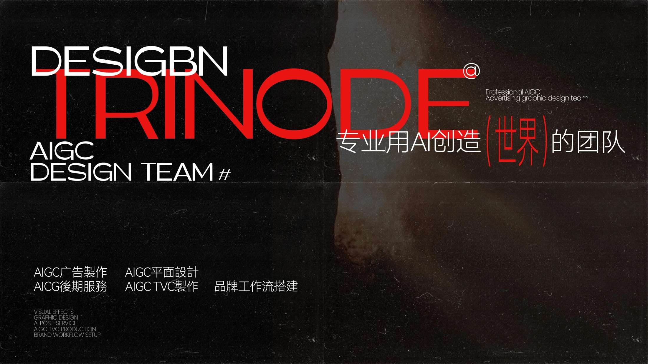
*Figure: TRINODE team visual business card, from the introductory materials provided by the team.*
What Kind of Team is TRINODE?
According to the team, TRINODE was established in Shanghai in 2025, focusing on commercial imaging and visual creation with AIGC as the core. Their work involves creative planning, storyboard design, content generation, and post-production. The team materials also list businesses such as commercial graphics, workflow customization, and training and education. For clients looking for a production team on VQOS, the most direct entry point remains the works: judging from the already displayed images, which direction your own project is close to.
This portfolio spans wider than a single-style display. Classical architecture, sports scenes, rural life, urban spaces, fantasy creatures, and product close-ups all appear in different projects. When observing this content, what is worth noting is the consistency within the same group of works: whether the colors are unified, whether the products are clear, and whether the characters and environment revolve around the same theme.
The following project names and images are compiled based on the materials provided by the team. The advertising part is mainly design/storyboard display, and the commercial graphics part is visual works; we analyze the creative direction based on this, and do not equate still frames with complete finished films.
Brand Advertising: Giving Stories, Characters, and Products Their Own Places
From Denza and Leapmotor to Hisense: Using Scenes to Organize Viewing Order
Denza Auto's storyboard for "New Year Bo Le Selects a Horse" places classical architecture, character costumes, and modern automotive space within the same visual narrative. The courtyard, performance scene, characters inside the car, and trunk shots play different roles: establishing the atmosphere, unfolding the action, and then bringing attention back to the product. The car can thus become part of the story.
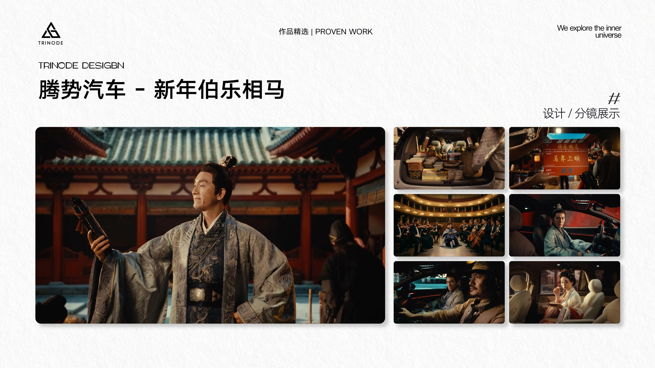
*Figure: Denza Auto "New Year Bo Le Selects a Horse" design/storyboard display.*
The work titled "Leapmotor — Sending the Little Bird Home" in the materials uses roads, forests, characters, and little birds as clues. It presents a different rhythm: the environment occupies a larger proportion of the frame, and character actions and natural scenes jointly establish the emotion of travel. Brands preparing automotive content can use this to discuss whether they need cultural narration, lifestyle stories, or direct product displays.
Hisense Air Conditioner's two World Cup-themed works also demonstrate different entry points for the same communication theme. The "World Cup Teaser" builds a sense of space through large buildings, stadiums, and character images; the "World Cup Product Release" connects more with home, football, and home appliance usage scenarios. The former is suitable as a reference for discussing visual momentum, while the latter helps discuss how to land the theme into daily life.
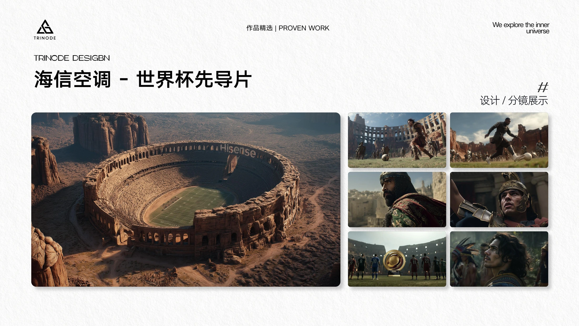
*Figure: Hisense Air Conditioner "World Cup Teaser" design/storyboard display; the portfolio also contains a World Cup product release project.*
JD.com, China UnionPay, Casarte, and LUX: Building Visual Language Around Different Communication Tasks
JD Supply Chain's "Wedding Wonderland" uses stylized spaces to connect multiple products, with color, scale, and lifestyle elements jointly constituting frames with e-commerce themes. For projects that need to present multiple products simultaneously, the reference it provides lies in: letting products share a visual world rather than just lining them up one by one.
China UnionPay's "Shanghai Marathon" works revolve around running figures, event clues, and brand text; Casarte's "Every Moment Upward is the Peak" also features athletic figures and different scenes. The two sets of works can be viewed together: when the communication theme involves sports and upward emotions, how do character actions, picture direction, and text position jointly build recognition?
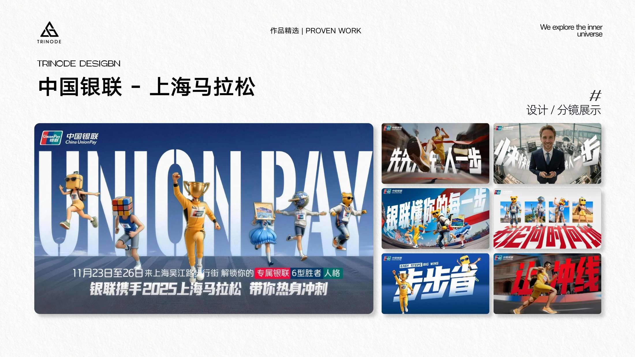
*Figure: China UnionPay "Shanghai Marathon" design/storyboard display.*
The storyboard for LUX "Tian Xiwei New Product Endorsement" adopts a soft product space, characters, and floral elements. Compared with sports themes, it lets colors and lighting shoulder more expression tasks. These differences remind clients: when choosing references, in addition to the same industry, you must also specify the desired emotion, rhythm, and product presentation method.
City, Humanities, and Music: Commercial Imaging Also Needs Its Own Emotion
Shanghai Xintiandi's "Origins of Xintiandi" presents city skylines, architecture, and character lives in different scales; Changzhi, Shanxi's "Humanities and Future of Changzhi" features rock carvings, landscape, architecture, and character scenes. The difficulty of urban themes is to give locations a recognizable temperament. Architecture and scenery can be backgrounds, or they can become clues to stories.
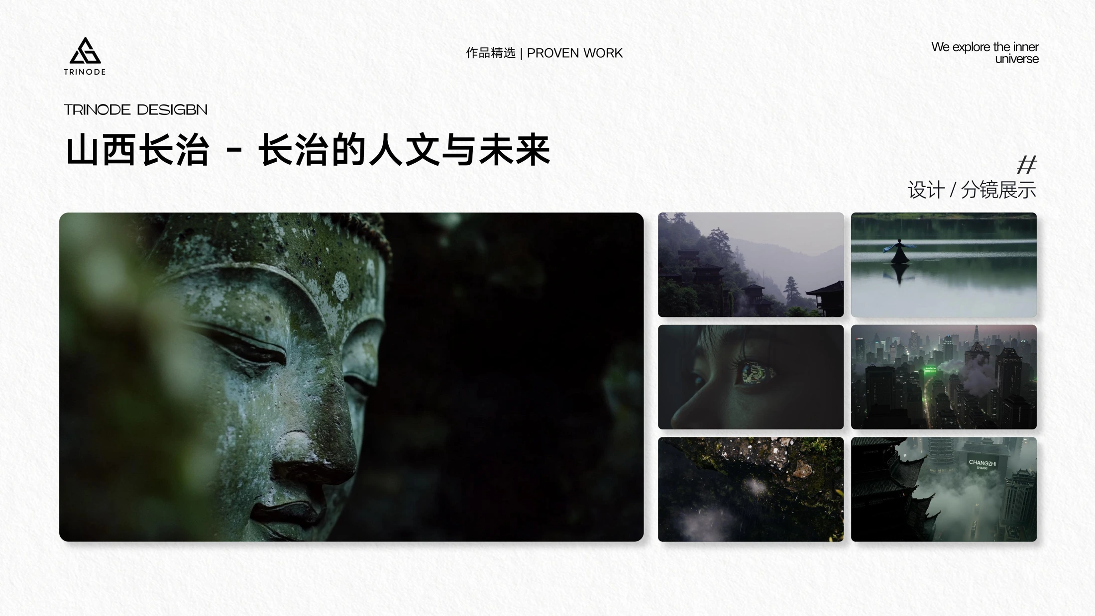
*Figure: Changzhi, Shanxi "Humanities and Future of Changzhi" design/storyboard display.*
Farmers' Daily's "Happy May Day for New Farmers" puts fields, rural roads, labor, and characters together to form a visual narrative closer to daily life. What the people in the picture are doing and their relationship with the environment will directly affect whether the theme can be understood.
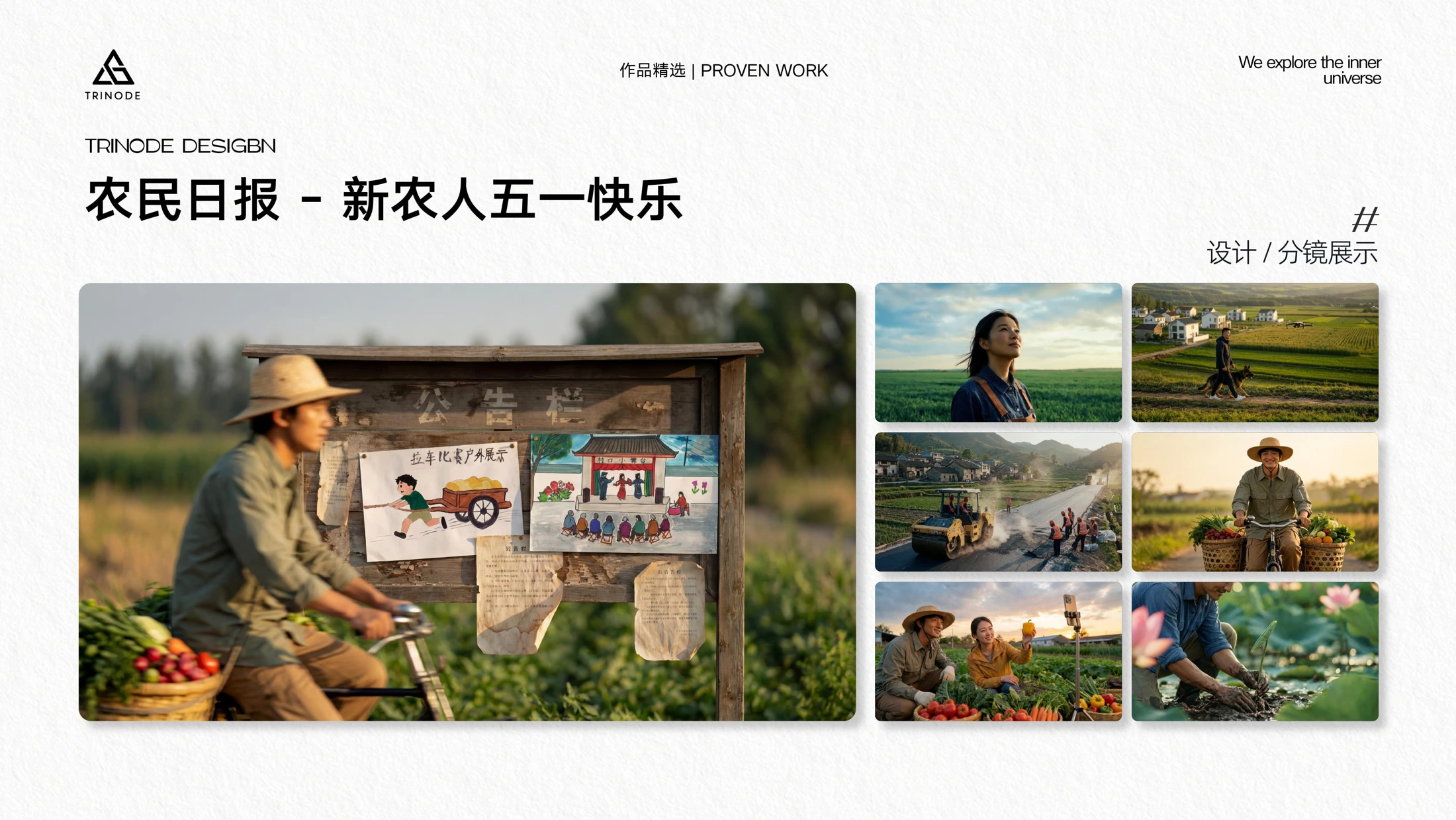
*Figure: Farmers' Daily "Happy May Day for New Farmers" design/storyboard display.*
The portfolio also features the red lighting and performance images of a Thai male artist's MV, as well as fantasy creatures, character close-ups, and various environments from the promotional short film of the Kling 2.6 model. Music videos rely more on lighting and character silhouettes to convey emotion; fantasy themes require maintaining visual clues that can be followed between different shots. What is shown here are two different directions for creative discussion, and the final movement, editing, and sound effects still need to be confirmed in conjunction with dynamic sample reels.
Social Creativity: Giving a Product Easy-to-Remember Imagery
Mengniu, Crocs, and Skechers: Characters, Silhouettes, and Cultural Elements
Mengniu's Double Pomelo Light Milk new product visuals use pomelo characters deployed around product packaging. Yellow, orange, and green run through the characters and environment, while the bottle remains in a recognizable position. It translates flavor into imagery and gives the packaging a clear visual position.
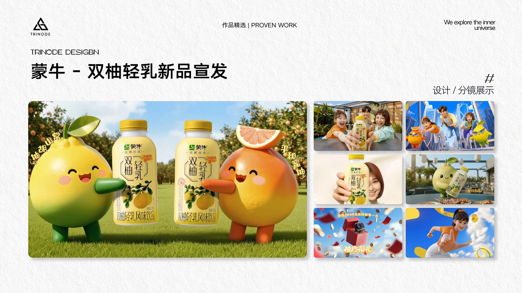
*Figure: Mengniu "Double Pomelo Light Milk New Product Release" design/storyboard display.*
In Crocs' social creative pieces, footwear appears alongside fantasy elements like clouds and balloons. The silhouette of the shoes remains recognizable amidst changes in the picture, with the fun coming from changes in the surrounding environment and scale. Skechers children's shoes' intangible cultural heritage Social promotional release combines shadow-play-style characters, lanterns, ancient cities, and flying horses, making cultural symbols part of the picture structure.
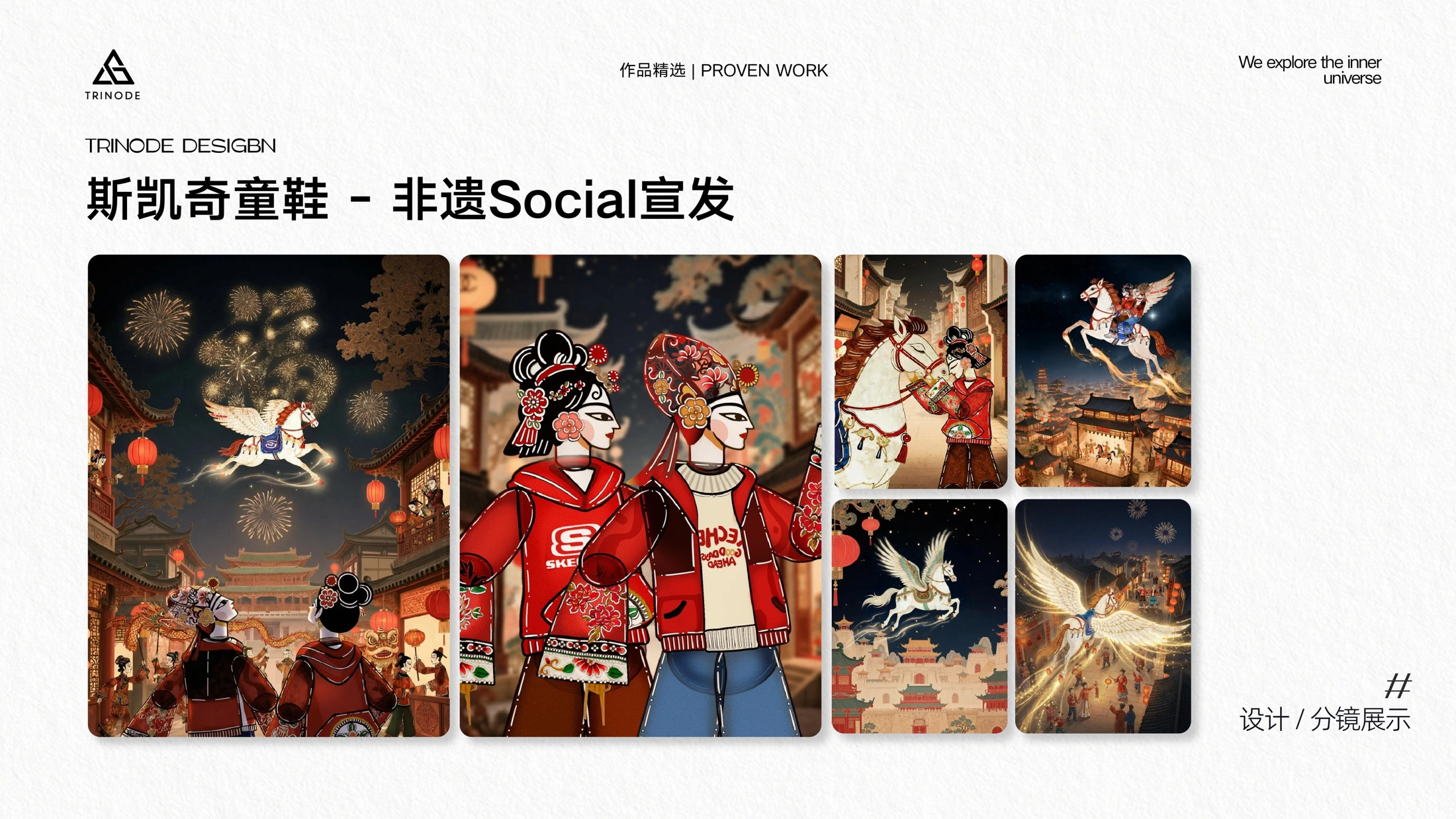
*Figure: Skechers children's shoes "Intangible Cultural Heritage Social Release" design/storyboard display.*
For food, beverage, and apparel brands, these sets of works can lead to the same question: What should be remembered most—packaging, product silhouettes, characters, or a certain cultural temperament? Once this priority is determined, subsequent scene design becomes easier to trade off.
MAC, W Hotel, and Heytea: Placing Products in Familiar Yet Unexpected Cities
MAC's 520 Social promotional release adopts a red, black, and white system, with brand ribbons, heart-shaped elements, and city landmarks repeatedly appearing in different compositions. W Hotel's "Nanxiang Steamed Bun Palace" combines soup dumplings, the Oriental Pearl Tower, and urban water surfaces to form a visual connection between dining products and location characteristics.
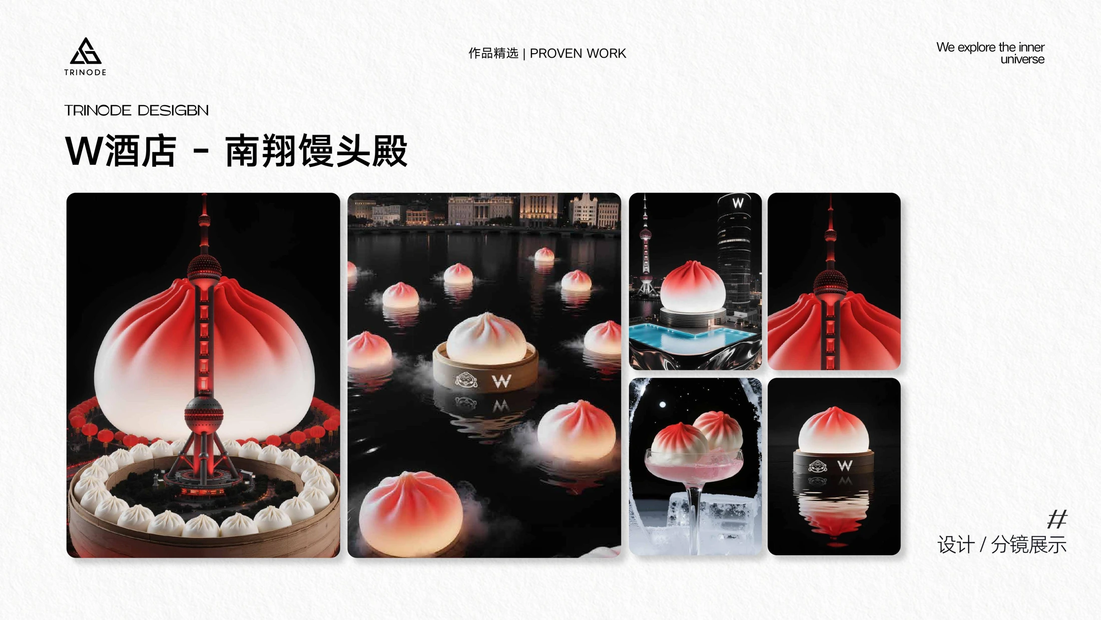
*Figure: W Hotel "Nanxiang Steamed Bun Palace" design/storyboard display.*
Heytea's works offer two directions: new product Social creativity combines drinks, tote bags, and urban space; another set of commercial visuals adds plush characters and street architecture, using character actions and product scale to form fun. Both bring brand packaging into specific scenes, but the emotions expressed are different.
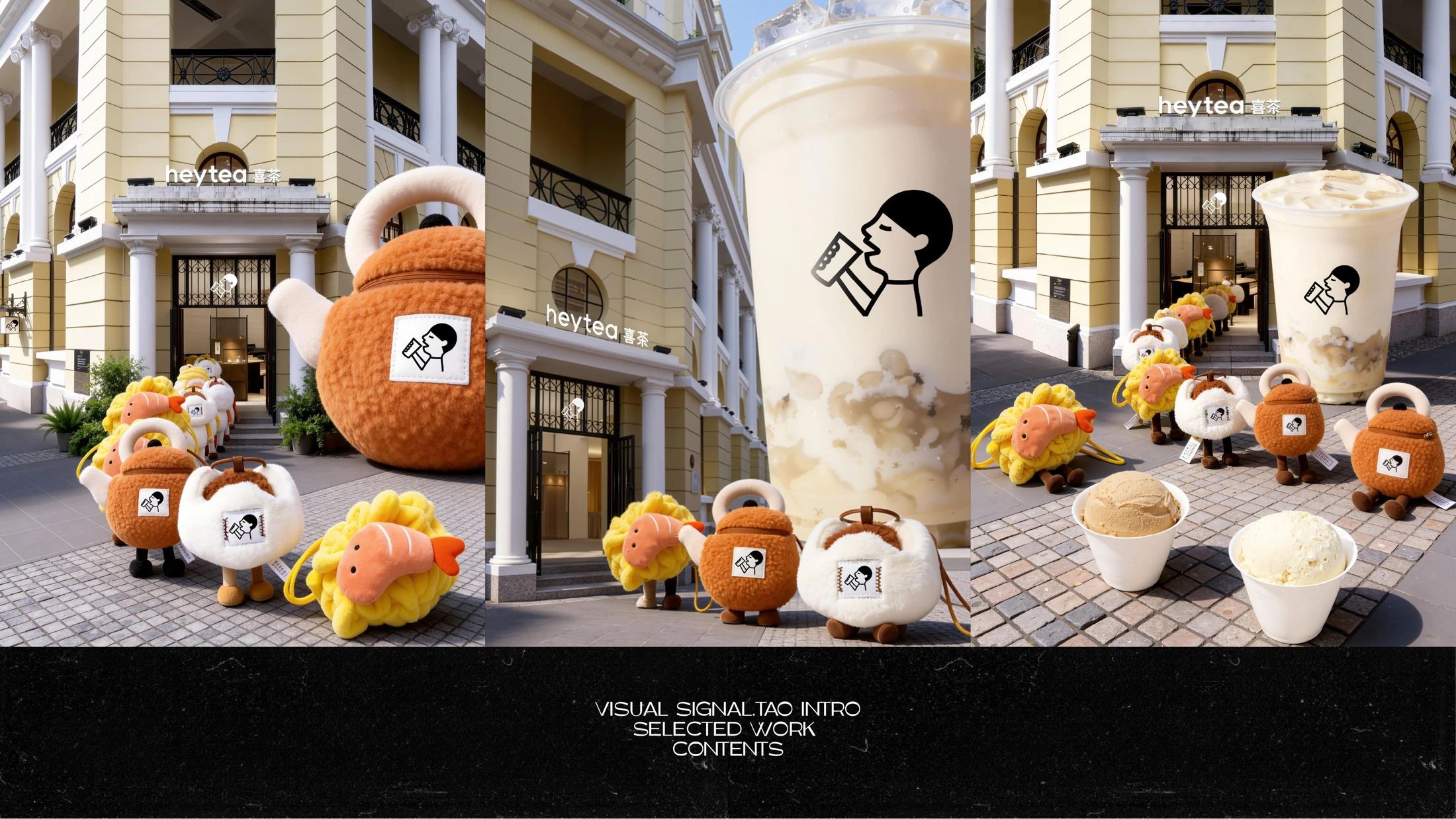
*Figure: Heytea characters and street scene visuals, titles organized by picture content.*
These works are suitable as discussion references for holiday marketing, new product communication, or social content. When expanding a single image into a series, one should also confirm the subject position after vertical cropping, the recognizability of the cover, and the versions required by different publishing channels.
Digital Products: From Lens Texture to Understandable Usage Scenarios
Mobiles and digital products account for a large proportion of TRINODE's materials, and there is more than one way of handling them.
vivo X200 Ultra series focuses attention on lenses, body, materials, and handheld posture. Large areas of dark backgrounds reduce interference, and close-up compositions help readers see the product form. Honor's red and gold visual series places red bodies, gold edges, fabrics, and water surfaces together to create contrasts between materials.
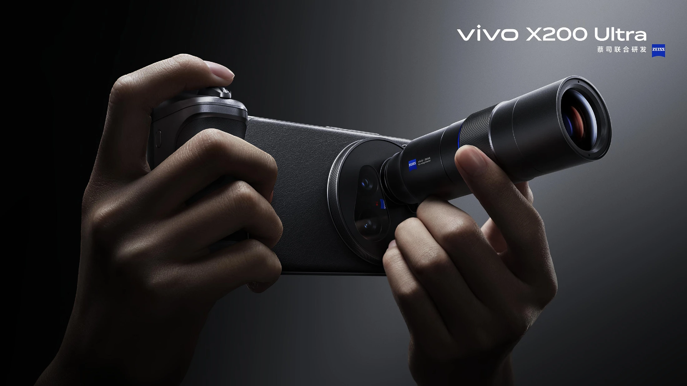
*Figure: vivo X200 Ultra product visuals; the complete series contains three pages of display.*
Another category of work emphasizes characters and style. In Huawei nova's silver fashion visuals, clothing, character postures, and linear installations revolve around mobile phones; Honor's mechanical aesthetics visuals adopt robots, mechanical hands, and metal flowers; another three pages of mobile phone character series make models interact with giant products, mirrors, and geometric spaces.

*Figure: Huawei nova fashion-style product visuals, titles organized by picture content.*
iQOO's images place mobile phones into campuses, sports equipment, and in-bag perspectives; vivo S50 adopts cats, flowers, and light-colored products to build a softer lifestyle temperament. Both expressions answer "what kind of life the product belongs to," but the color, perspective, and prop choices are obviously different.
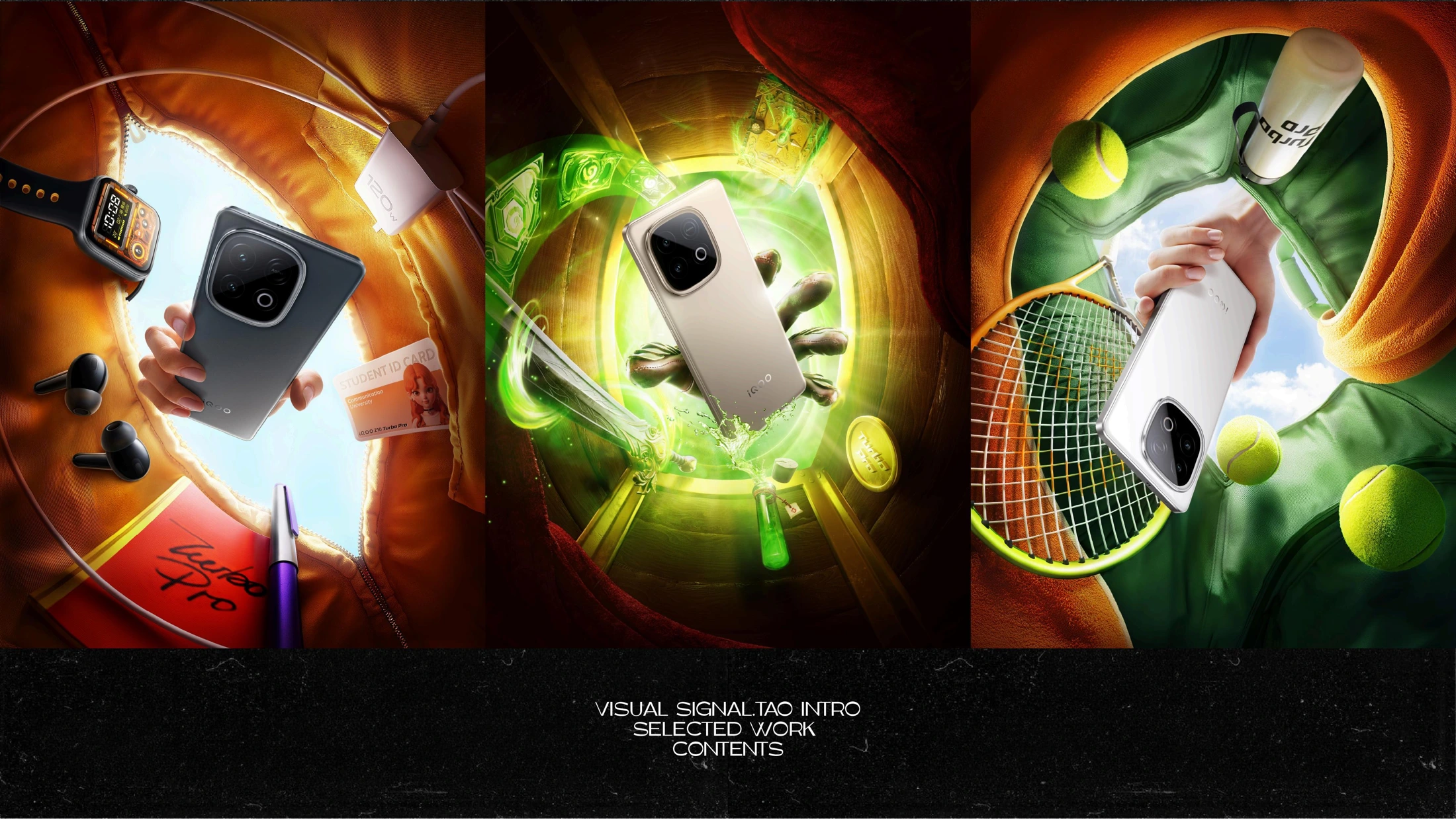
*Figure: iQOO product visuals, titles organized by picture content.*
vivo Vision's sports, audiovisual, and gaming images present usage scenarios through the relative positions of living rooms, characters, and virtual content; vivo Pad6 Pro puts characters, seats, and products into a unified composition to keep the series consistent.
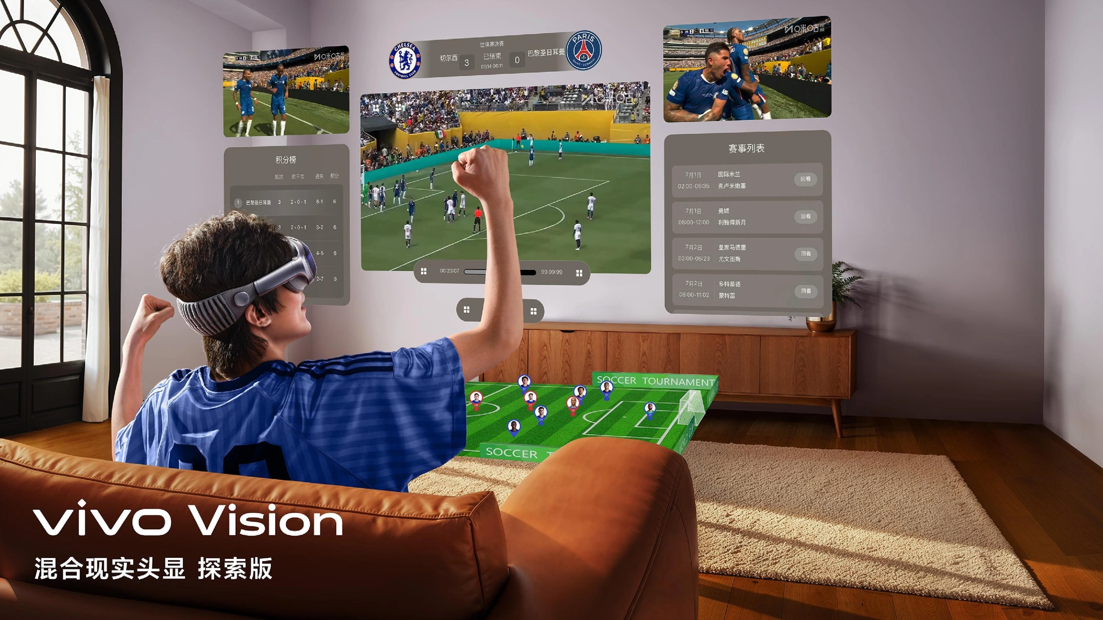
*Figure: vivo Vision experience visuals; the portfolio also showcases audiovisual and gaming scenes.*
For digital brands, communication can begin by determining which task the work needs to accomplish: displaying appearance texture, establishing style impressions, or illustrating usage scenarios. Whichever is chosen, product structure, packaging text, and confirmed functional information should all have accurate reference materials.
Beauty and Automotive Graphics: Extending a Single Brand into a Group of Images
PRADA and YSL: Packaging Shapes Are Also Compositional Clues
PRADA's pink and green beauty visuals allow the triangular product outer shape to echo with geometric window frames, with character faces, fabrics, and indoor color blocks unfolding around the packaging. YSL's red gift-giving visuals combine gift boxes, heart-shaped backgrounds, characters, and products to build a unified gift-giving atmosphere.
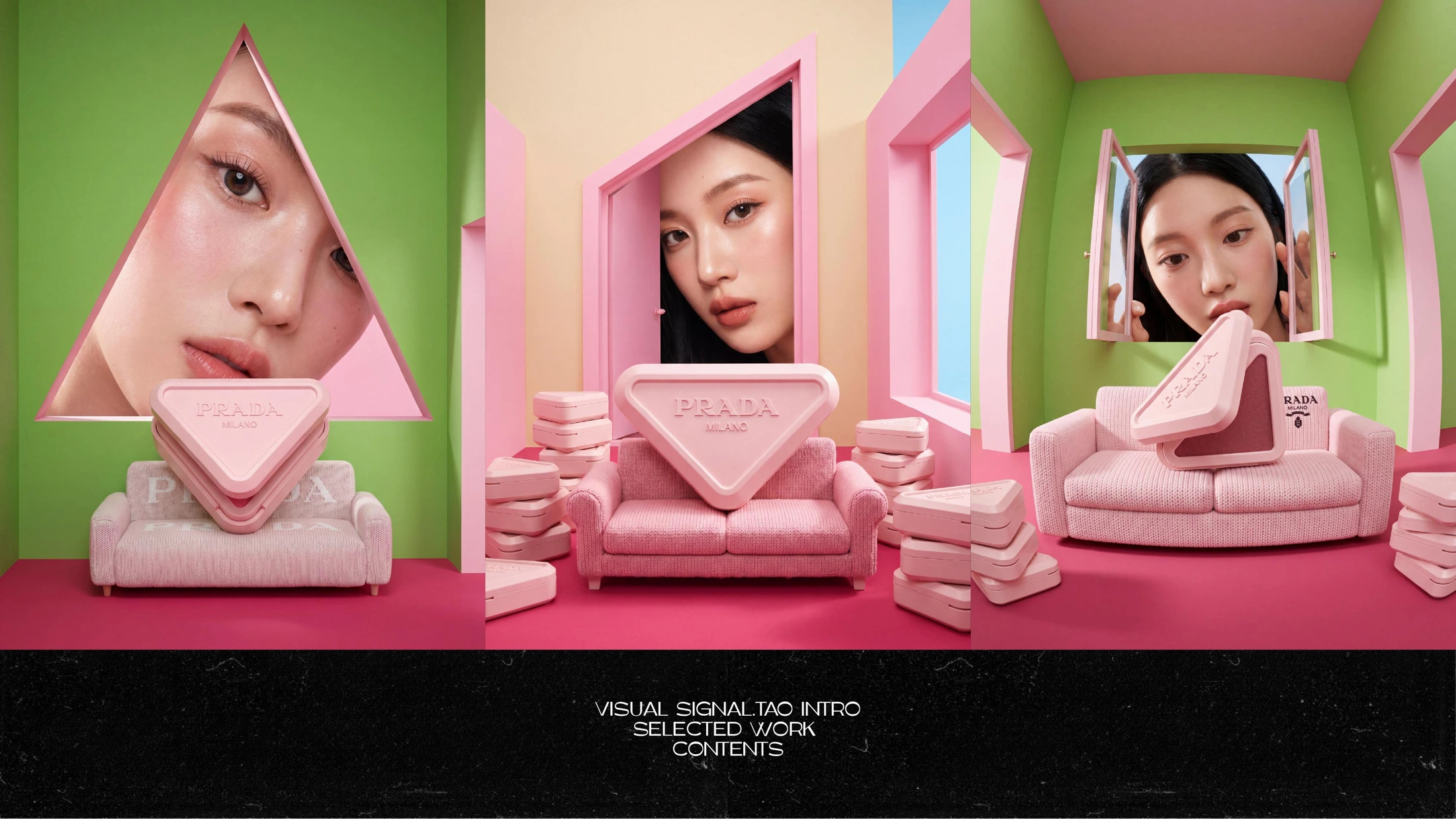
*Figure: PRADA beauty visuals, titles organized by picture content.*
The reference value of these two sets of works lies in how to find compositional clues from packaging. New products do not necessarily require complex stories; sometimes as long as the product shape, brand color, and character relationship are clear enough, a main visual suitable for expansion can be formed.
Leapmotor, Voyah, Zhijie, Volkswagen, and Wuling: Expressing Different Lifestyles Through Different Scenes
automóviles commercial visual section showcases multiple directions: Leapmotor enters lantern festivals, folkloric decorations, and reflection scenes; Voyah Dreamer connects with snow mountains, wooden cabins, and family trips; Zhijie R7's green car body is placed beside warm-colored buildings, streets, and swimming pools, letting light and shadow emphasize the car body silhouette.
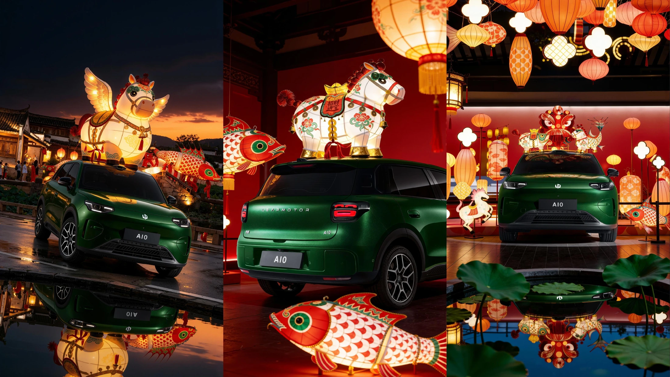
*Figure: Leapmotor Auto holiday visuals, titles organized by picture content.*
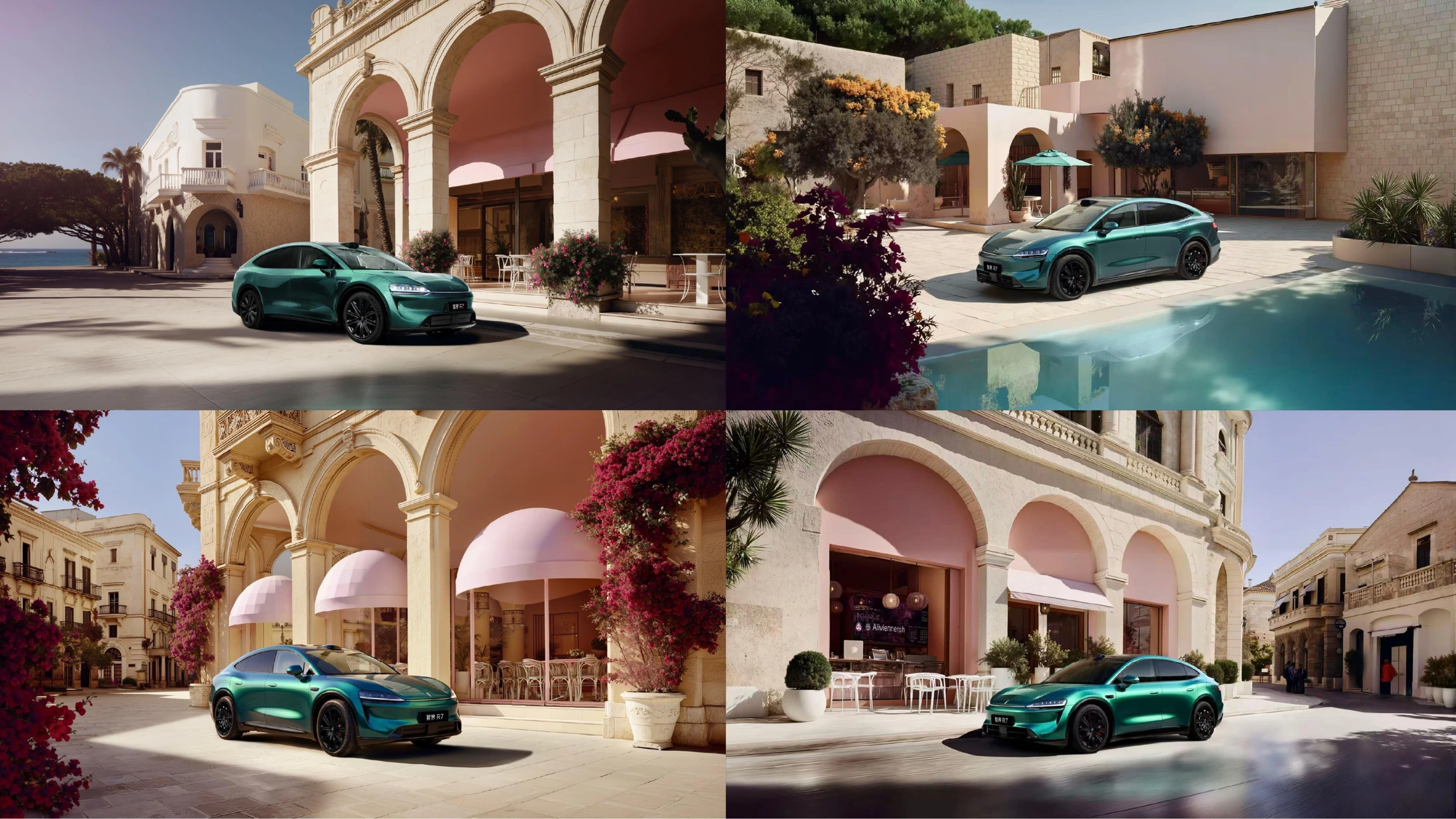
*Figure: Zhijie R7 architecture and light and shadow visuals, titles organized by picture content.*
Volkswagen's 520 theme images adopt red heart-shaped installations and character compositions; Wuling and ice cream-creature creative images put small cars, packaging, pandas, and city landmarks into high-saturation environments. They present different visual proposals, and brands can choose discussion directions based on vehicle positioning, communication nodes, and audiences.
When master visuals need to be delivered in groups, agreeing in advance on which elements remain consistent and which can change is more effective than giving piecemeal revision opinions one by one. For example, vehicle model and color schemes are fixed, while scenes, angles, and lifestyle props can change; such rules also help short films, posters, and social covers remain unified.
Lots of Works, How to Choose References Suited to Your Project?
You can start from tasks first, then select visual styles:
Brand Stories and Advertising Short Films: Look at storyboards for Denza, Hisense, Leapmotor, JD.com first, focusing on the relationship between characters, scenes, and products.
Event Communication and Humanistic Expression: Refer to China UnionPay, Casarte, Shanghai Xintiandi, Changzhi in Shanxi, and Farmers' Daily to discuss how themes enter specific images.
New Products and Social Creativity: Combine Mengniu, MAC, Crocs, Skechers, W Hotel, and Heytea to confirm the priorities of characters, packaging, and brand symbols.
Digital and Product Main Visuals: Choose appearance, material, or usage scenario directions from series by vivo, iQOO, Huawei nova, Honor, etc.
Beauty, Automotive, and Series Graphics: Compare PRADA, YSL, and multiple automotive visuals to clarify the colors, compositions, and product characteristics that need to be maintained consistently in a set of works.
One to two clear references are usually easier to start communication with than mixing dozens of pictures together. After selection, you can add a sentence about "why you like it": is it the scene scale, character state, packaging presentation, or a certain color and lighting? This will help the team understand what truly needs to be preserved.
On VQOS, Directly Submit Production Requests to TRINODE
Workflow items listed in TRINODE materials include business docking, execution communication, test preview, still frame pictures, video generation, post-packaging, delivery, and review. During actual cooperation, you can follow these nodes to confirm creative directions, deliverables, aspect ratios, versions, feedback rounds, schedules, and quotes in advance.
You can enter the TRINODE Team Homepage, view the works, and click "Submit Request to This Team". Directional requests will not be displayed as public lobby projects, and the content is only visible to you, the designated team, and platform administrators with permissions.
The first round of communication does not need to write a complete script. Prepare brand or product materials, usage channels, expected duration and aspect ratio, target date, budget range, and bring along one or two favorite reference works to make the discussion more specific. If you need to produce videos and commercial graphics simultaneously, you should also list their respective delivery scopes clearly.
[View TRINODE Team and Works, Initiate Directional Request](/studios/trinode)
*Material Explanation: Team information, work names, and original images come from "TRINODE Introduction and Cases" provided by TRINODE; this article is an original editorial interpretation by VQOS. Brand names are used to identify projects and visual content in the work materials and do not imply endorsement of VQOS by the respective brands. Commercial visuals without explicit formal project names adopt descriptive titles.*